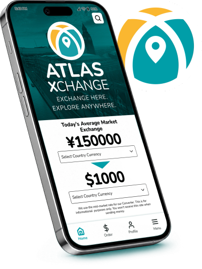
ATLAS XCHANGE
MAKE CURRENCY EXCHANGE EASY AND SIMPLE.
ATLAS XCHANGE is a (fictional) web-based software platform that provides foreign currency exchange services. A single location source location to get currency exchange rates, locations to trade or acquire foreign currency at home and or have currency delivered to the comfort of home.
THE PRODUCT: Design an app and a responsive website to help global travelers find the current exchange rates between two currencies. They can also use this information to quickly and easily exchange currencies through various options.
UX COURSE PROJECT DURATION: 10 weeks; 2025–2026
ROLE: Brand & Logo Design, Brand Identity, Web Design | Visual Design, UI | UX
BUSINESS GOAL: Design a product to help engage more clients.
Many people want an easy and simple way to exchange currency without the process of being too overwhelmed in the checkout process.
USER PROBLEM: Currency exchange feels overwhelming and foreign to those that do not travel often.
Available information, conversions rate information is not readily available or clear. Finding a place that works with most consumers schedules can be problematic.
USER RESEARCH: Summary
Interview groups and secondary research contained a range of different generation groups. The majority consensus agreed that they are always looking out for the best exchange rates while voicing the issues of complications with getting currency at times. Majority of the groups travel for cultural reasons and new experiences. Many rely on having technology to help them.


Understanding users & building for beyond the normal user
Not only understanding the normal user pain points, but also understanding the non-typical users that may have avoided or had difficult using a similar service in the past.
From insight to interface
Direct and to-the-point layout for the customer to get to their desired end goal. Prioritized the least amount of screen switching to get to end goal through multiple avenues.
Designing the structure
Explored a low-fidelity prototype from the user flow diagram & wire frames to validate structure, hierarchy and functionality.
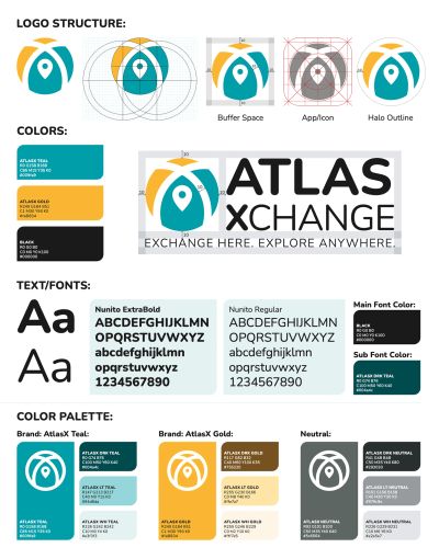
Creating the Brand & Identity
Green and Gold are universally common colors that represent currency and money. When choosing a color palette, primary color picks met WCAG AA Compliance before building out the UI for each screen while maintaining brand identity.
Using only one typeface: Nunito for headlines and for body copy. Mixing too many different typefaces can make the overall layout seem busy and harder to ready. A rounder type face was chosen to create a friendlier feel.
Implemented a text hierarchy throughout the design. This helps users to distinguish the different sections and information on screen.
Designing elements for consistency & scale
Design system built to make sure that designs are consistent, scale easily and faster. Designs that would be easy to adapt with changes.

Refining the Design
Based on insights from the usability studies, applying design changes such as adding an item task flow, providing clear instructions, and simplifying the navigation.

Developing the Product
Create a cross-platform responsive design. Build the same experience for all users, no matter what type of device they choose to use.

Takeaway
IMPACT:
The design strategy included an efficient concept design that increases task efficiency multifold, and improves engagement with the application and build out.
WHAT I LEARNED:
While designing this app and website, I learned that the first round of ideas for the project are always changing are only the beginning of the process. Usability studies and peer feedback influenced each iteration of the app’s design.
Any thoughts and insights on this topic is greatly appreciate. All feedback is essential to further enhancing my skills and findings of this study.